
This blog was originally posted in June of 2021. A year later it is being updated a bit to include more information on some of the newer paints. Please note that the recommended primer color is listed both on the back of the bottle and on the individual product description pages on the website.
=====
Once the Zenishifts got introduced, there has been a lot of speculation as to how Turbo Dork paints would look over different colored base coats. After all, the Zenishifts look very different over black and white. So why not others? Why stick to the boring recommended primer color that is listed on the bottle?
I am a scientist at heart and training so I wanted to give you real-life examples of how these paints look over different colored primers. So I conducted an experiment under the most controlled conditions that I could in my garage and kitchen.
Hypothesis:
- The color of Metallics is independent of the color of the base coat.
- Turboshifts are very much dependent on the color of the undercoat.
- Zenishifts will flip-flop depending on the base color.
Experimental Design:
I chose four matte primer colors (black, grey, tan, and white) and sprayed a bunch of square glass cabochons with them. I then placed one square of each primer color on a piece of cardboard and airbrushed them all simultaneously with a single Turbo Dork color. Lastly, all the examples were photographed and labeled.
Disclaimer: It should be noted that it is hard to get even coverage over white with some of the darker paints. However, the photos shown below give you a good idea of the overall trends.
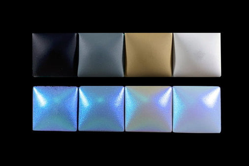
Below is the strip with just the base colors showing. The order of the different base colors (black, grey, tan, and white) is the same for all of the pictures.

Metallics:
Almost all of the Metallics have black as their recommended undercoat color. There are a few exceptions: those recommended over white but can be used over black (Absinthe, Bees Knees, Curacao, Multi Pass, Pearly Gates, and Pucker) and the pastels ( Maguro, Matcha, Momo, Sakura, Taro, and Yuzu) for use over white. In both of these cases, the recommended base color is white in order to emphasize their light colors.


As shown in the photos, the overall color of the Metallics does not depend on the color of the base coat. However, there is a trend that these paints tend to be at their darkest over black, and lightest over white.Taro, in particular, illustrates this point. When placed over black, this pastel paint, loses its soft, pale tone and takes on a deeper hue.
Turboshifts:
I have broken the Turboshifts down into different categories based pretty much on how they look in the bottle.
- True2Color - looks like one of the shifting colors
- White Base - looks white with a few flecks of color
- Red Base - looks red even though the shifting colors are not red
- Grey - looks grey with a few flecks of color
- Zenishifts - looks like one of the two colors

True2Color Turboshifts:
Turboshifts classified as True2Color are those that look like one of their shifting colors in the bottle (Ice to Never, Miami Sunset, Molten Mantle, Shifting Sands, and Sweet Dreams). The example True2Color results are shown below


As with the Metallics, the photos of these True2Color Turboshifts show that the darker the base the more intense the color and the more dramatic the shift. Overall these paints appear a bit paler and show less of a transition over a white primer as opposed to a black primer.
White Base Turboshifts:
Some of the lightest shifting colors and many of the “original” Turboshifts appear white in the bottle (4D Glasses, Cloud Nine, Crystal Cavern, Mother Lode, Shell Shocked, and Sugar Rush). Results for two White Base Turboshifts are shown below.


In both these cases, these paints become pearlescent over white having lost most of their deep color. It is this trend that Mother Lode takes advantage of for its "mother of pearl" look and is the reason that it is the only Turboshift that is recommended for use over white.

When placed over black, the final color of Mother Lode is dominated by the greens and blues in the mix. The pink and yellow that show up over a white base are obscured.
Red Base Turboshifts:
Most of the “original” Turboshifts are Red Base (3D Glasses, Afterburner, Dark Net, Electrum, Forrest Flux, Ground is Lava, and Radium). Examples of how Forrest Flux and Afterburner look over different undercoat colors are shown below.


The Red Base Turboshifts fade out over white to give an unappetizing, reddish color. It is almost as if one is just seeing the color that shows in the bottle.
Grey Base Turboshifts:
The difference in Grey Base Turboshifts was only first appreciated after this blog was originally posted so there are no photos (Grave Robber, Laserface, Let Them Eat Cake, Lunar Eclipse, Rainbow Roll, Scarab, Sky Rat, Supermassive, and Wave Length). However, the differences observed over different colored primers are clear cut: black primer = the color and shift expected while white primer = grey (just like in the bottle) with no shift.
Zenishifts:
The different look over black versus white for the Zenishifts is in how these paints look has been widely advertised (Bubblegum Crisis, Prism Power, and Twin Sons). However, folks have asked how they look over grey. So I tested Twin Sons.

As anticipated, Twin Sons showed up a green-gold over black and blue over white. However, neither color was dominant when the paint was placed over either grey or tan. Instead, there was more of a blue/green/gold shift going on. I have seen this same sort of effect happens with other Zenishifts.
Conclusions:
-
Metallic paints tend to be fully saturated over black, a bit lighter over grey, and lighter yet over white.
- True2Color Turboshifts act like the Metallics; the darker the base the more intense the color and the more dramatic the shift.
- White Base Turboshifts fade to white over a white undercoat and show very little if any shift.
- Red Base Turboshifts show up as reddish over a white undercoat and show very little if any shift.
- Grey Base Turboshifts show up as grey over a white undercoat with no shift at all
- Zenishifts show one color over black, another over white, and both over grey.