Greg says I am happiest when I am experimenting. So I am currently ecstatic. Most Turbo Dork paints are semi-transparent, so what color they go on top of can influence how they look. Following that logic, ignoring the usual recommendations for basecoat color provides us whole new areas of color to explore.
For years, the recommendation for most of the Turbo Dork Metallics was to use them over a "black" basecoat. A few pastels used white but the party line across the board including everything I wrote said to stick to "black" where suggested. Then came some user feedback and "black" was relegated to the dark corners of the warehouse with the new formulation. To get better coverage and brighter colors, the recommendation for many of the Metallics was updated to a "similarly colored basecoat".
That got me thinking about what we mean by "similar". Would something else be better? This launched a series of internet searches and quite a bit of testing of different basecoat colors resulting in this blog post. Before I start talking about specific results, I want to emphasize that this blog is about Metallics, specifically those of notoriously tricky colors like yellow. Don't try this at home with Turboshifts.
NOTE: Turboshifts, except Mother Lode, MUST be used over a black basecoat to see the shifting effect. Zenishifts REQUIRE a strong zenithal base for the two different colors to show.
Definitions:
Numerous terms describe what goes under a layer of paint --- primer, undercoat, basecoat. According to several internet searches: Primers are applied to a bare surface to create a smooth and consistent surface for paint to adhere to. Undercoats, typically used over a primer, improve coverage, mask imperfections, and neutralize underlying colors. Basecoats are the foundational layer of paint applied to a surface to provide a solid, even surface for the final coat to adhere to.
Are you confused by all the terminology? Me, too. An undercoat is always a primer, but a primer is not always an undercoat while basecoat is a catch-all phrase. Quite often these terms are used interchangeably in the tabletop miniature world. Greg chose to use the term Basecoat to describe what goes directly under the first coat of a Turbo Dork paint for better coverage and brighter colors, regardless of whether there are other lower layers. I will be using it throughout this post with this definition.
Paints:
Some paint colors can be tricky, potentially appearing muddy (yellow, orange, red, gold, etc.). Brightening such colors can be achieved by using a lighter color underneath. Alternatively, darker colors can potentially make an awkward color richer. Complementary colors (red-green, blue-orange, yellow-purple) which bring contrast can bring out a vibrancy in the top layer of paint. Alternatively, a darker or lighter analogous color, i.e., colors next to each other on the color wheel such as red and red orange, can create depth and a smoother transition to an adjacent section.
Most Turbo Dork Metallics, as mentioned above, are semi-transparent and therefore are susceptible to changes in basecoat color. So I set about collecting ideas for colors to try with several Metallics (Pucker, Multipass, Redrum, People Eater, Cool Ranch, Summoning Sickness, Silver Fox, and Gold Rush).
Experimental Details:
3D-printed models were painted with standard opaque paints to provide an even basecoat. Round model bases were painted with the same colors to visually provide a comparator in the final photos. A photo of the basecoat color for each model is shown on the left of the model.
Models with specific basecoat colors were painted with the a Turbo Dork Metallic to be studied. The number of coats varied by how well the Metallic covered the basecoat color.
All of the models were photographed using a cell phone and the same basic setup of a small studio box and lighting.
Yellow (Pucker):
Originally, it was suggested that Pucker be put over white. Now the recommendation is to use it over a yellow. Internet suggestions include an orange or pink to help enhance the vibrancy of yellow. The figures below show the results obtained by using various basecoats.
The shade of yellow used as the basecoat subtly influenced the final color of Pucker while orange acted as if it were midrange yellow. In contrast, the pale pink showed though the Pucker layer having it take on a rosier hue that I personally not fond of.


Orange (Multipass):
Like Pucker, Multipass was originally to be based on white. Now the recommendation is to use it over an orange. Several suggestions popped up with an internet search. These included yellow, red, magenta, and brown. All of these colors were tested and shown in the photos of the figures below.
Similar to the results described above for Pucker, the shade of orange used as the basecoat influenced the final color of Multipass while yellow acted as if it were midrange orange. However, the warm red, magenta, and brown each substantially changed the final Multipass color in interesting ways. I might not use the brown base color in the future but the warm red and magenta has possibilities.


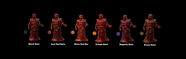
Red (Redrum):
At first Redrum was supposed to go over black and was subsequently changed to a red without further specification. Redrum is cool, i.e., having a blue undertone. So I was interested in seeing a comparison between a cool red and a warm red. Also adding orange would take the basecoat a step warmer. Lastly, internet searches turned up suggestions for using magenta or brown under red. The photos below show the results obtained by using the different basecoats.
Using a cool red base results in Redrum appearing as it does in the bottle. Both a warm red and orange brighten up the color of Redrum. It is not quite the cherry red that folks ask for but getting close. Both magenta and brown dulled the color of the Redrum and added their own undertones.


Purple (People Eater):
People Eater, the original Turbo Dork Metallic, now has purple as its suggested basecolor. An internet search turned up suggestions of grey, purple, and black (the original Turbo Dork recommendation). Also, since I had a blue black and a cool red, I decided to try them with People Eater. The final figures are pictured below.
There is a nice gradient of shades of purple for People Eater used over the different purples, grey (not shown), and blue black. Only the cool red changed the overall tone to a tempting reddish purple.

Blue (Cool Ranch):
Another old timer, Cool Ranch, started with black as the suggested basecolor but subsequently switched to blue. Internet suggestions included both warm and cool purple which I interpreted as blue purple and red purple. The figures below show the results obtained by using various basecoats.
Like People Eater, there is a nice gradient of shades of blue for Cool Ranch used over the different blues, grey (not shown), and blue purple. Similarly, the red purple is the only test basecolor that changed the overall tone resulting in a slightly purplish blue.

Green (Summoning Sickness):
I picked Summoning Sickness rather than Gordian for my green test since it is such a distinctive color --- olive with bits of yellowish gold running through it. When Summoning Sickness was first released, it was suggested that one could use either white or black for the basecoat color. The current descriptions for this paint includes a similar color like green as well as the original black or white. The tested basecoat colors are shown below. I decided to include the warm and cool purples described above for Cool Ranch as I found a mention of using purple under a dark green.
In the past, I have found that Summoning Sickness does not cover well over white, so I did not test it for this post. The olive base is the color most like what I think Summoning Sickness should be. While using any of the others, including black (not shown), produce a darker tone without the gold highlights.

Silver (Silver Fox):
Lots of references suggest some shade of grey for under silver paint. The lighter the paint the more "silvery" the result should be. So, I tested Silver Fox with light and dark grey along with the current Turbo Dork recommended black (photo below).
Light grey and white (not shown) give similar results with a slightly brighter silver color, though nowhere as bright as Tin Star. Whereas, dark grey and black look the same, slightly darker, essentially the color in the bottle.

Gold (Gold Rush):
Gold Rush, a midrange gold, still has black as its recommended basecoat color. However, many resources suggest colors in addition to black --- black for deep gold, brown for warmer, red/orange for very warm, and white/yellow for bright.
The examples in the photo below show the differences expected for the various basecoat colors. With black as the starting point, yellow lightens the overall look, red warms it, and brown deepens it.

Addendum:
There is one other piece of information that I want to add that is not discussed in this blog but was tested along with the examples for Redrum, i.e., using paints other than typical hobby opaques as the basecoat. These include glossy paints, inks, and fluorescents. I have shown several times with side-by-side test that using a gloss base does not change the final look of a Turbo Dork paint. The midrange cool red gloss I tested under Redrum gave similar results to the cool red opaque shown above. Likewise, the cool red ink and the warm red fluorescent paint tested appear similar to the respective red opaque samples.
Conclusions:
I still recommend Turbo Dork newbies stick to the party line for basecoat colors. However, for the cognoscenti, have fun tweaking the final color of the metallics to create the look you want.
Lastly, remember the color of the paint/ink used is more important than its formulation for determining the final look of a Turbo Dork Metallic painted model.