
I often field questions about how to take a model to the next level with Turbo Dork paints. "Is applying shade all over going to ruin the shift?", "What do you suggest to use as a highlight color?", "Can I use a one-step paint with Turbo Dork colors?", etc. So, it seems like it is time to do a blog that answers as many questions on different approaches as possible, illustrated with examples. This also seems like a good time to emphasize the recent updates to the website for each color.
When I wrote the Illustrated Guide some time ago, I encouraged everyone to think of Turbo Dork paints as providing a "normal" canvas for their creativity. This is mostly true, but there are some gotchas. Hopefully, I can use this post to illustrate some basic Turbo Dork paint principles. There will be some "notes" interspersed with the descriptions of the ten dragons of the title.
The examples I am showing here are my take on things and are not intended to limit the possibilities for your experimentation. Please share photos of what you have come up with on your social media tagged with #turbodork or @turbodork. Or if you have works in progress and want some feedback, post them on the Turbo Dorks Facebook Group.
=====
Note 1 - My Guiding Principle
Turbo Dork Paints are not subtle. You will be happiest with the results if you play to their boldness. So go big.
=====
My first step in thinking about this post was to pick a single medium-sized model to illustrate multiple techniques. I went with the Deep Cuts W14 Blue Dragon by Wizkids. This model fits my slightly quirky personality --- it was described by someone as a dragon taking tea with the queen, pinky extended. But more importantly, it has enough surface bumps and niches to work well with some things I had in mind.
I then picked a base color scheme. For this post, I wanted to pick one turboshift and a single metallic. I went with Ice to Never for the body/wings and the complementary Maguro for the belly. I specifically chose Ice to Never as it is what I call a true-to-color turboshift, meaning it essentially looks like itself in the bottle. Therefore, I knew it could be used over a wide range of base colors without losing too much of its original color.
With a few exceptions, the dragons were sprayed with matte black primer. The belly was then painted over by hand with matte white primer followed by several coats of Maguro. The body and wings were hand-brushed with Ice to Never. Lastly, a few details like the claws and spikes received a coat of Black Ice.
=====
Note 2 - Primer Color
While there is lots of wiggle room with primer color for the metallics, most look darkest over black. However, some of the paints including the pastels like Maguro, look best over white.

In fact, in general, the pastels look darker and very silvery over black (left) versus white (right) for Taro.

The RECOMMENDED PRIMER color is listed on the bottle and the individual product paint pages.
In contrast, all the turboshifts, except Mother Lode, require a black or very dark undercoat to look like the pictures on the bottle. Mother Lode looks green when placed over black (left) as opposed to "mother of pearl" over white (right).

Turboshifts are thousands of tiny mica prisms that were designed to reflect a particular set of colors off a black surface. Therefore putting them over white can radically change the outcome.
If you are an experimenter at heart and want to see what different colors look like over different bases, then you may want to read the notes below for some helpful hints.
=====
Note 3 - Turboshift Subtypes
There are four subtypes of turboshifts. Identifying each subtype based on the color of the paint in the bottle allows one to predict what a turboshift will look like over white. The first group is true-to-color, i.e., the paint in the bottle looks like one of the intended shift colors. These paints, including Ice to Never, appear paler when used over white rather than over black.

The other three subgroups have very different properties over a white primer. They appear as either white, red, or grey in the bottle.

These turboshift subtypes are identified on the individual product pages under COLOR IN BOTTLE. In addition, the relevant behavior is described in a note on the product page.
White turboshifts not only look white in the bottle but will not show much color if placed over a white primer. See the Blue Raspberry example over black, grey, tan, and white. Red turboshifts look reddish in the bottle even when the shifting colors are not red. These paints show up as orangish-red when used over white (Forrest Flux). Lastly, grey in the bottle means grey when painted over a white surface (not shown).


=====
Note 4 - Gloss Versus Matte Primer
A gloss primer is not necessary. The examples below show several different brands of primers used for in-house side-by-side tests. These tests have not shown a significant difference between gloss and matte. However, I acknowledge, some folks still swear that gloss works better for them.


=====
Note 5 - Hand-paint Versus Airbrush
I specifically chose to hand-paint these models as an example to the users who do not own or are not comfortable with an airbrush. Using an airbrush is essential for trying to cover large areas or where the surface needs to be super smooth. Trying to hand-brushing a gunpla figure to get a good-looking model is going to be very hard. However, many figures do not require that special touch and can look great the old-fashioned way. That being said, Greg airbrushes everything (.5 nozzle at 30 psi and thinned with a few drops of airbrush medium), while Meredith and I primarily hand-brush (thinned with Citadel contrast or lahmia medium if needed).
=====
Note 6 - Forumulation
I could not quite figure out where to put the following information but here seemed the best place. Turbo Dork as a company is continually trying to improve the formulation of its paints. The current paint is freeze-stable down to 10˚ F/-12˚ C. It is thinner so one can hand-brush most of the paints without the need to dilute. Also, coverage is better with many metallics only needing a single coat, and most turboshifts will shine with only two or three coats.
Lastly, this is not related to the formulation, but I wanted to throw in a comment about the new silicone palettes. They have the Momma Dork seal of approval.
=====

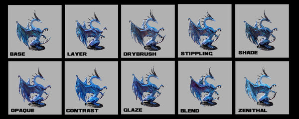
BASE MODEL
The Base model is the plain Jane figure described above with no additional highlighting or shading. The photo below shows just Ice to Never, Maguro, and a touch of Black Ice.

=====
Note 7 - Photos
Please note that all of the photos were taken at the same time with the same setup to facilitate the comparison of the base to each of the made-over models. In this case, the photography was done with a phone under natural light in my backyard. As long as the weather is good, this is now my favorite way to photograph these models.
=====
SHADE MODEL
Using a commercial shade/wash on a miniature is probably the first thing that every new painter attempts, including myself. It is simple and a great way to spruce up a model to enhance the appearance of depth. In this case, several coats of Citadel Nuln Oil were applied all over the model surface. Although this slightly darkened the surface a bit, the blue-to-purple shift still shines through while adding greater definition.

Note 8 - Shading
For those with the patience and time, applying the shade/wash to just the recessed areas will provide even more striking results.

Also, although I only showed black here, the world of other colored shades/washes is wide open for you to experiment with. I have found that something with a pink tone looks particularly nice with Mother Lode.
=====
Note 9 - Gloss Versus Flat Shades/Washes
Games Workshop used to sell gloss shades including a version of Nuln Oil that had been my go-to. The shade used for the figure pictured above was the new "non-gloss" formulation which still has enough shine to satisfy me. However, please note that other black washes such as those by Army Painter or Vallejo leave the surface very matte/dull. If this is what you want, then great, if not you may need to apply something like a polyurethane varnish.
=====
DRYBRUSH MODEL
The next technique that I learned back in the day was drybrushing. Edge highlighting came along a bit later but these two techniques have remained the most used in my toolbox. With Turbo Dork turboshifts, I tend to pick a metallic color that mimics one of the colors in the shift for drybrushing. In addition, I usually use a light, potentially sparkly, color for edging. See the notes under the LAYER MODEL for help choosing colors to use.
In this case, I used Purl Grey which is a midrange, silvery-purple, and concentrated on hitting the high spots on the body and wings. I also hit the edges with Tin Star. As shown in the photo below, these additions have made the purple pop while softening the blue. The photo also shows a bit of drybrushing with Da Ba Dee on the belly.

=====
Note 10 - Drybrushing
Drybrushing is usually described as a technique that can be used to achieve a blurred or soft appearance. Using a bit of paint on one of the popular makeup brushes that miniature painters seem to like will give you that effect with a Turbo Dork color as shown below (Forrest Flux alone and drybrushed with three different Turbo Dork paints).

Alternatively, I usually prefer a bit stiffer brush as done for the dragon example model. I like being better able to highlight specific distinctive features. In either case, using a metallic over a turboshift versus another turboshift allows for more contrast. However, it should be noted that you will likely want to drybrush the model several times to make the highlight stand out.
=====
LAYER MODEL
While some hobby paint companies are known for their matched color triads (base, layer, and highlight), Turbo Dork paints, in general, have not been promoted based on this concept. However, there are a few exceptions of turboshifts that were specifically designed to work well together: Lunar Eclipse/Miami Sunset/Cloud Nine and Wave Length/Ice to Never/ Crystal Cavern. One of the reasons that I picked Ice to Never for the base model was so that I could take advantage of a matched set. See the notes below for help choosing a color scheme.
Traditionally, one would start with Wave Length as the base, then add Ice to Never, and finally finish with Crystal Cavern on top. However, since I wanted the bottom layer to be Ice to Never for all the models, I inverted things a bit by adding Wave Length over top of Ice to Never in the deep recesses. Crystal Cavern was then used on the high spots.
The final result after applying several coats of Wave Length and Crystal Cavern is shown in the photo below. Putting a turboshift over a turboshift, as opposed to painting a metallic over a turboshift, can be fairly subtle. However, the final result allows for a smooth transition from peaks to valleys.

=====
Note 11 - Picking Colors
Looking for a specific blue to go with your next project? Then check out the website (https://turbodork.com/collections/all-paints) and use the filters to tune in on what is available.

In addition, there are several blog posts (https://turbodork.com/blogs/momma-dorks-miniature-musings) that have featured a particular color such as pink, red, green, etc. with painted examples of each shade for the specific color.
=====
Note 12 - Related Colors
Have a specific paint in mind and want to find what might look good with it? Then look at the individual product pages. Each color has four hand-picked related colors displayed.


=====
Note 13 - Tone
Lastly, all of the paints have been characterized as shadow, midrange, or highlight paint to help in picking the right level of lightness or darkness. This information is listed as TONE on the individual product page.
=====
CONTRAST MODEL
For this post, I am going to refer to all of the different brands of one-step paints as "contrast", kind of like "xerox" for photocopying or "kleenex" for tissues. All of these paints provide base color, shade, and highlight all with one application and have become popular as something that users like to try. I chose to go with Army Painter Speedpaints, though most of the examples that I have seen have used Games Workshop Contrast Paints.
This dragon example was primed with white rather than black. I followed that with a generous coat of Magic Blue Speedpaint and a layer of clear coat. Lastly, the model was painted with Ice to Never. Please note that I intentionally chose this color of contrast paint as I wanted the effect to stand out.
Using the brighter blue contrast paint as an undercoat for the Ice to Never gives the model a distinctly different look with an altered color, muted shift, and some shading. However, this does provide a more uniform layer for further highlighting.

=====
Note 14 - Contrast Paints
An alternative use of a one-step paint favored by Meredith is to use it as sort of a wash over the Turbo Dork layer to shade and tint them.
=====
OPAQUE MODEL
Using colored opaque paints under Turbo Dork highlight paints is a technique that some of our users have latched onto. Getting good coverage of Turbo Dork paints over white primer can require many coats. Therefore putting down a coat of a standard opaque followed by the Turbo Dork paint, speeds up the process considerably.
In this case, I primed the dragon with white. The belly was then painted with Vallejo Game Color Electric Blue and topped with a single coat of Maguro. Also just to give another example of what a change in undercoat color could do, I painted the body/wings with Vallejo Game Color Hexed Lichen followed by the Ice to Never.
The deep blue of the Vallejo paint eliminated the need for repeated coats but darkened the overall look of the belly somewhat. Use a lighter opaque to keep the final color close to that of Maguro. Interestingly, using the Vallejo paint under the Ice to Never did deepen the purple shift on the body and belly.

=====
Note 15 - Opaque Undercoat
It should be noted that there is currently not as much of a need to improve coverage for some paints over white as there was previously. However, it still is an issue for others, in particular the yellows, pinks, and oranges.
=====
GLAZE MODEL
Glazing is not something I have done very often, but I wanted to show that this technique can be used to enhance the intensity of one of the shift colors for a turboshift. I used a homemade glaze mix with People Eater on the wings over the Ice to Never. The rest of the body was not treated with the glaze. However, I did use a glaze made from Turbo on the belly.
As can be seen on the side of the wing facing the camera, the addition of a semi-transparent layer of People Eater modified the appearance of the Ice to Never by increasing its purplish appearance. In addition, the belly has taken on a slightly darker blue tinge with the addition of the Turbo glaze.

=====
Note 16 - Glazing
I have used commercial glazes in the past. For this example, however, I created my own using a glazing medium by Vallejo. The final mixture worked well but left a slightly dulled finish.
=====
STIPPLING MODEL
For this model, I added a touch of Cool Ranch on the belly to add some depth but then covered the Ice to Never on the wings with bits of several different purples and blues (Turbo, Maguro, People Eater, and Purl Grey). In addition, there is a touch of Tin Star for some sparkle. I randomly placed the different colors and just keep adding them until the final look is something I wanted to keep.
As shown in the photo below, this combination of paints over the Ice to Never has generated a dramatically different look that almost appears as if the wing membranes are paper thin with light showing through.

=====
Note 17 - Stippling
As opposed to glazing, stippling is a technique that I use a lot. Several of the figures that I have talked about in this blog were essentially created with stippling (Shrine for Short Green Guys, Curacao Is for Skinks, and It's Not a Turtle). It is a great way to essentially create a unique shift combination.

=====
BLEND MODEL
Various blending techniques intended to create smooth transitions between two or more colors are available to the painter. I used a wet blending method with People Eater and Ice to Never to create the look shown in the photo below. While there is a bit of a purple-blue color in the area between the two paints, the overall effect with Turbo Dork paints is not as dramatic as the transition that can be achieved with standard opaque paints. It should be noted that turboshift paints do not necessarily follow standard rules when it comes to mixing/blending (see the second note below).

=====
Note 18 - Two-brush Blending
I have been asked about two-brush blending but this does not work well for Turbo Dork paints. If you want one color to gradually taper across another, then using a technique that is more like feathering is a much better strategy - paint the dark color, paint the highlight, and draw out the edge of the highlight color so that it blends against the dark color.
=====
Note 19 - Mixing Turbo Dork Paints
When one mixes two metallics, the result is pretty much as anticipated. Mixing a metallic with a turboshift can come out OK but the result may not be exactly what you predicted with the metallic dominating. The real roll of the dice comes with mixing a turboshift with a turboshift. Sometimes you get something interesting but other times the mix just does not work. The examples below were done with a 50:50 mix.


=====
Note 20 - Mixing Turbo Dork Paints and Other Paints/Inks
Mixing Turbo Dork paints with other acrylic paints or inks can easily overwhelm the color of the Turbo Dork paint. Therefore, if you are doing this, try adding only a tiny bit of the paint or ink at a time. Also, beware that the final mix may not be very glossy and may be very thin depending on the amount of other material added.
=====
ZENITHAL MODEL
A favorite technique to show light on a figure is, of course, zenithal priming. This example is done to show the use of zenithal priming for a standard turboshift. See the note for comments on zenishifts below.
After spraying the model with black primer, white primer was added in the direction of the upper right down to the lower left to mimic the light coming from that direction. The figure was then painted in the same manner as the Base Model. As seen in the photo, the face, upper parts of the arms, and the trailing edge of the wing are a bit lighter with less of the purple shift than is typical for Ice to Never. Other parts of the model, particularly the front part of the wing, appear to be in a shadow.

=====
Note 21 - Zenithal Priming and Turboshifts
It should be noted that as a true-to-color turboshift (see Note 3), Ice to Never will still appear blue when placed over white. However, the white, red, and grey turboshifts, will not look like this if you try a zenithal prime.
=====
Note 22 - Zenishifts
Zenishifts are technically a subset of turboshift but they behave so differently that is almost as if they were two metallics poured into the same bottle which brings me to the point of this note. A light spray with white primer over black will probably not cut it for getting the two distinct colors of a zenishift. You either need to make sure that the white goes on heavy or supplement the color by hand-painted the area that you want to be "white" with white paint. An example of the intensity needed for the white is shown below.


=====
Note 23 - Detailing
One technique that I have not talked about is panel lining. Somehow I did not think that a dragon with pin washing would look that great. In addition, this technique is not exactly my forte. So my only words of wisdom are to make sure that you seal the acrylic Turbo Dork paint before adding any enamel. The example used Tamiya Panel Line Accent Color Black over Blue Steel with a polyurethane varnish in between.

Note: 24 - Varnish
One last note. All of the acrylic and polyurethane varnish brands that I have tested did not cause any ill effects with no wrinkling/crinkling/fogging/clouding when applied in thin coats over a dry Turbo Dork painted surface. Choosing one brand over another comes down to personal preference. An example of the different finishes for Vallejo Polyurethane is illustrated below.

Lastly, a word of warning, since Turbo Dork paints are acrylic, using a solvent-based varnish like a lacquer can eat away at the paint surface.
=====
Concluding Remarks
I know this post has been a real data dump, but I hope that I have covered most of your burning questions, included helpful examples, and provided enough tips to get you moving forward with your next project.